
Colour Story
#01
Colour can be fun to play with when painting, however, it can also be a challenge to know what colours to put together
In this series, I explore various combinations and use the colour wheel to help me put colours together that I don’t usually work with.

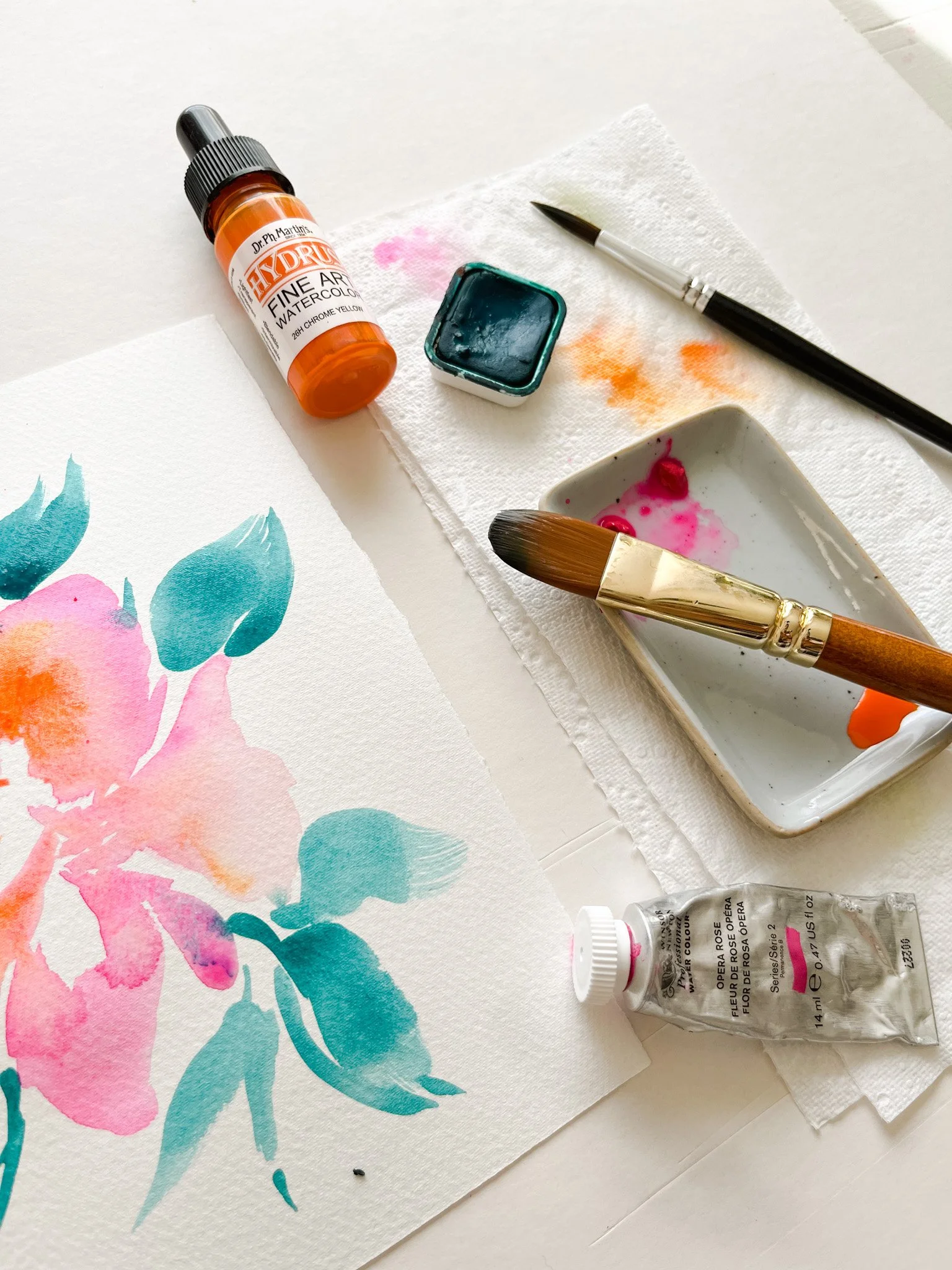
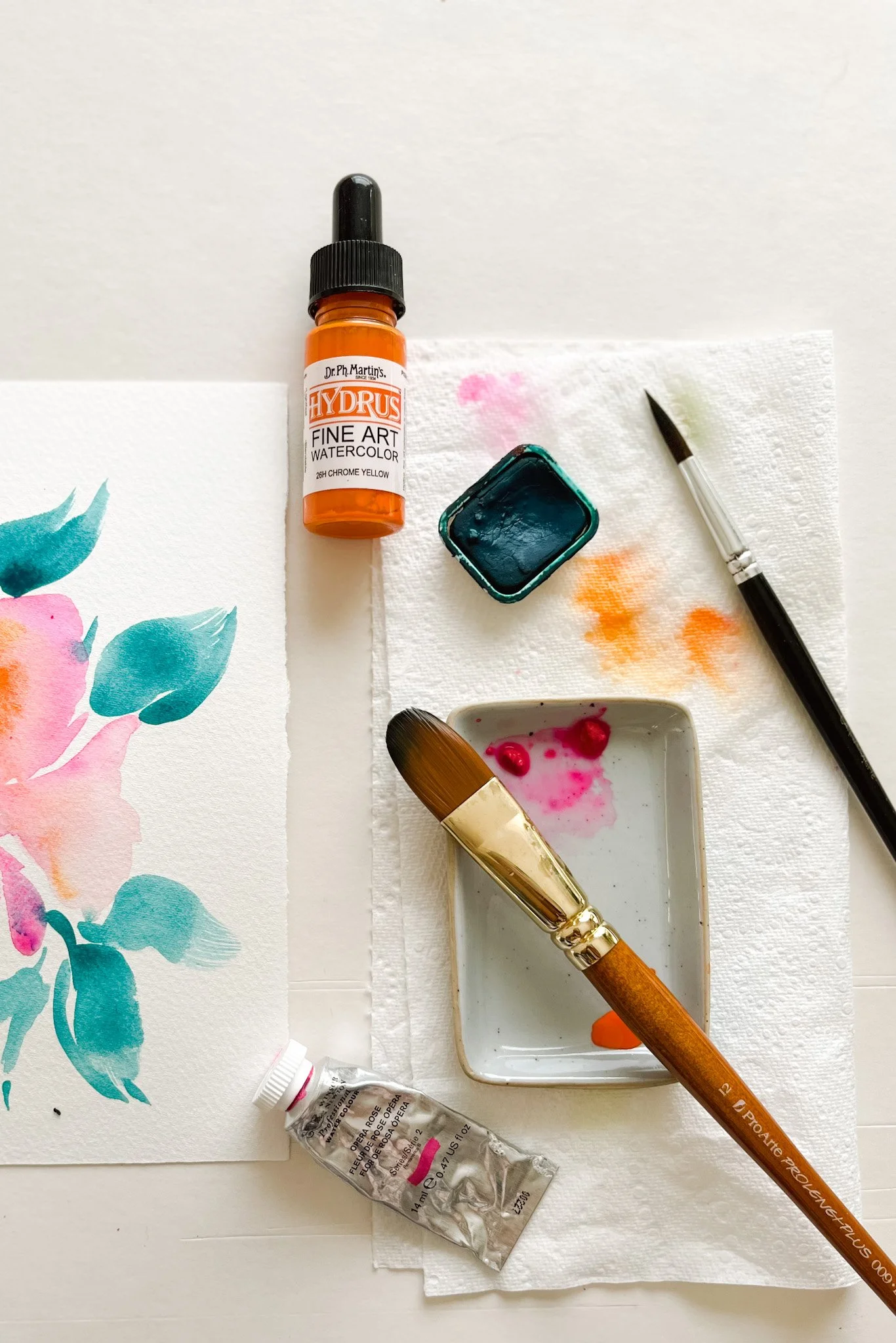
Pink and orange sit near each other on the colour wheel, so they contrast each other well.
I’m going to use a couple of colours from my paint collection and see how they work together.

Ready to experiment with me?
Watch the video below:
Did you notice that I added a 3rd colour to this painting? I used a teal colour. It sits on the opposite side of the colour wheel, because of that we call this a complimentary colour.
You can use a complimentary colour to help make your other colours pop.

My Supply List
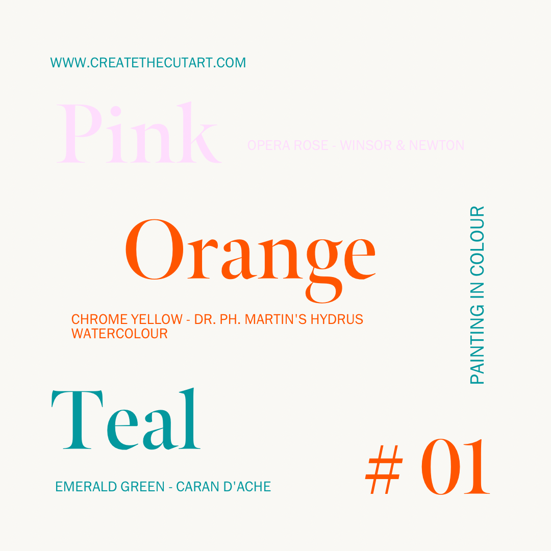
Pink - Opera Rose - Winsor & Newton
Orange - Chrome Yellow - Dr. Ph. Martin’s Hydrus Watercolour
Teal - Emerald Green - Caran D’ache Gouache
* All products listed above are linked to my favourite art supplier - Jackson's Art. They carry an excellent range of products and also ship worldwide. If you decide to make a purchase, my affiliate link will give you 10% off your first order.
Get experimenting!
What to do…
⟡ Pick 2 colours on the colour wheel that sit near each other on the spectrum. In my case I went for a pink and an orange. These were the colours I used for my main subject.
⟡ To help make your subject pop pick a colour that sits opposite on the colour wheel, this is your complimentary colour. Use this colour to add little details but don’t use too much of it.