
Floral Painting + Bibi Cameron Colours
I recently had the chance to try out some absolutely gorgeous inks from fellow artist Bibi Cameron, who shares her love of papercraft on her blog and YouTube channel. These intense, vibrant liquid colours are a unique blend between concentrated watercolours and inks—super bright, fluid, and full of creative potential!
The set I’m using is called Retro Brights, and as always, when I get new supplies, I love to start with a swatch test. This helps me understand how the colours behave on paper, how they mix with water, and how they work together as a palette.
Swatching the Retro Brights Inks
To get started, I placed small amounts of each colour onto a ceramic plate. These inks come in handy squeeze bottles with a nozzle tip, making it easy to dispense just a little bit at a time. Since they are water-based, they react beautifully with water, giving that fluid, organic feel that I love in my paintings.
Using a round brush on watercolour paper, I swatched out the full-colour range:
Red
Orange
Violet
Purple
Blue
Indigo
Green
Yellow
I always recommend swatching your colours first, as it gives you a clear idea of how they look on your specific paper and how they interact with water. Here’s how they look swatched out on my Fabriano Artistico paper…

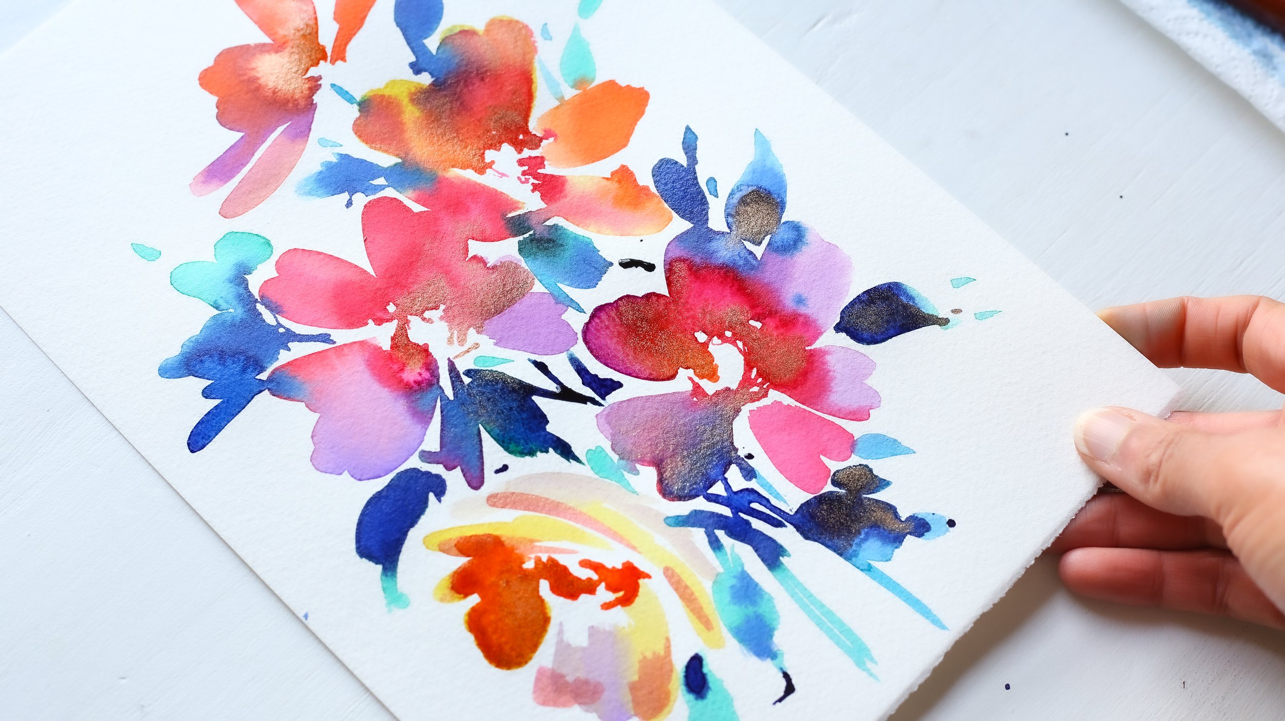
Painting a Floral Composition
Once I had familiarised myself with the colours, it was time to create a floral composition. Right away, I noticed how effortless these inks are to use! Since they are pre-mixed and beautifully curated, I didn’t have to spend time figuring out which shades would work well together—they already harmonised perfectly.
That being said, the colours are incredibly bold and bright, however, I personally love to paint with colours that are so bright and bold. They really do create an energetic feel in my paintings, and they flow beautifully on the paper, producing those gorgeous bleeds and blends that make water-based mediums so magical.
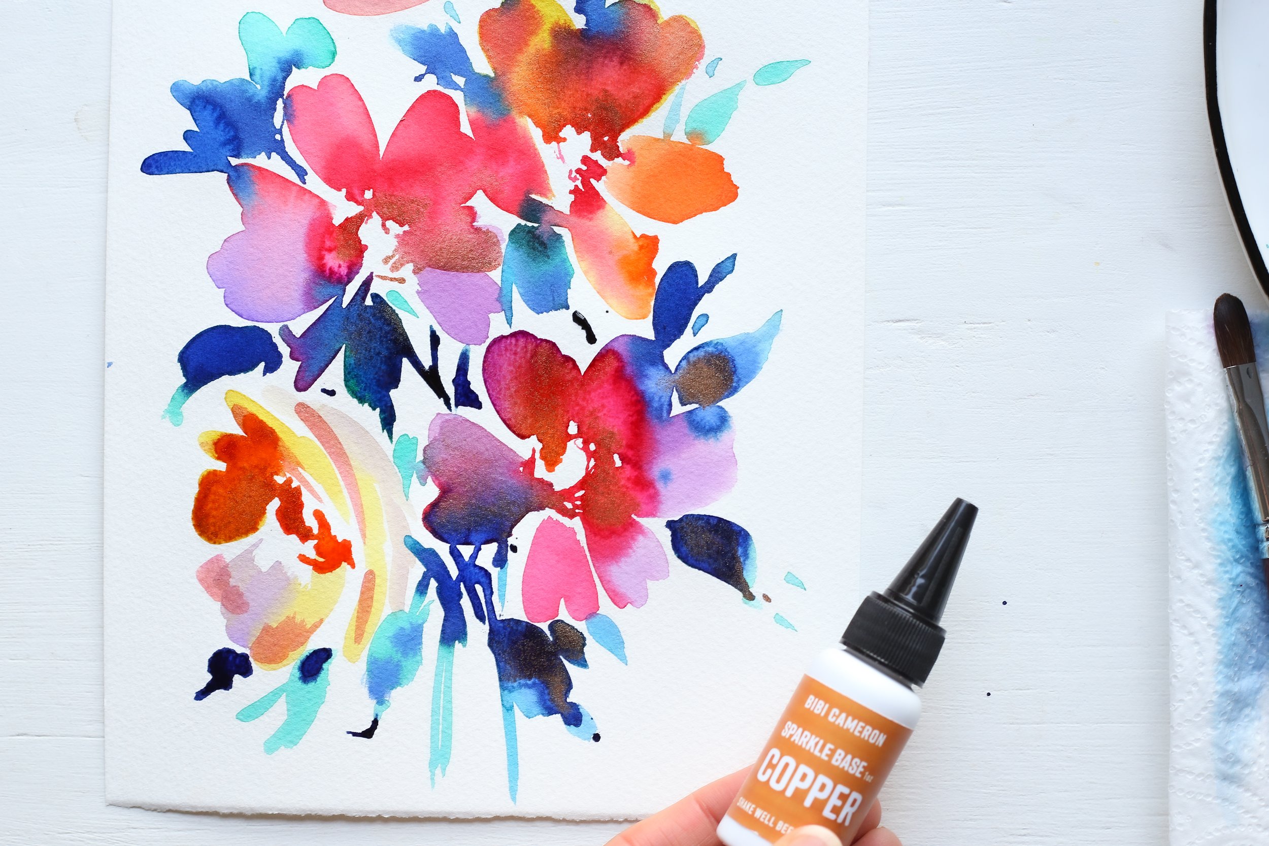
Adding some sparkle
Alongside the Retro Brights, I also received the Sparkle Base Collection—a set of shimmery
liquid colours in Silver, Gold, Bronze, and Copper. These are almost like sparkly ink, and just like the Retro Brights, they come in bottles with the same convenient nozzle.
I decided to add a touch of Copper to my floral piece, and it worked beautifully against the vibrant colours. The shimmer catches the light in such a delicate way, adding an extra element of interest to the painting.
Below is my finished composition and a little video so that you can see that sparkle -
With these, you can mix and match colours for even more variety. Below is my swatching and painting process:
I absolutely loved working with these paints! The flow, and vibrancy, were so fun to use and if you’re looking for bold, expressive colours that blend effortlessly and allow for colourful, loose painting techniques, I recommend giving them a try. I also did one more painting using these colours and with the gold sparkle base - here are my results below:

In addition to the Retro Brights, there are two other collections available which I haven’t tried but might be worth a look:
Bohemian Regals
Tuscany Earth
If you’d like to try these inks for yourself, I’ve included affiliate links below. I hope this post (and my video) have inspired you to experiment with liquid colours and create your own inky floral masterpieces!
The inks in the Intense Colours range use Direct Dyes, which have a Fair to Good lightfastness rating. Lightfastness refers to how well a colour resists fading over time when exposed to light.
The AATCC (American Association of Textile Chemists and Colorists) measures lightfastness on a scale from 1 to 8, where:
1 = Least resistant to fading
8 = Highly resistant (similar to automotive-grade pigments)
The dyes used in these inks fall between 4 and 5, meaning they offer moderate durability but may fade over time with prolonged exposure to sunlight.
The Sparkle Base Colors, on the other hand, don’t use traditional dyes. Instead, they contain Iriodin, a pearlescent pigment that gives them their beautiful shimmer. Pearlescent pigments are generally more light-stable than dyes, meaning they may hold up better over time. However, there isn’t a specific lightfastness rating available for these colours.
To keep your artwork looking its best, consider displaying it away from direct sunlight or using a UV-protective frame.