
How To Paint Vibrant Watercolour Paintings
The biggest thing to help me achieve super bright watercolours is in the materials that I use. The paint that you use will basically determine how bright and brilliant your paintings will look.
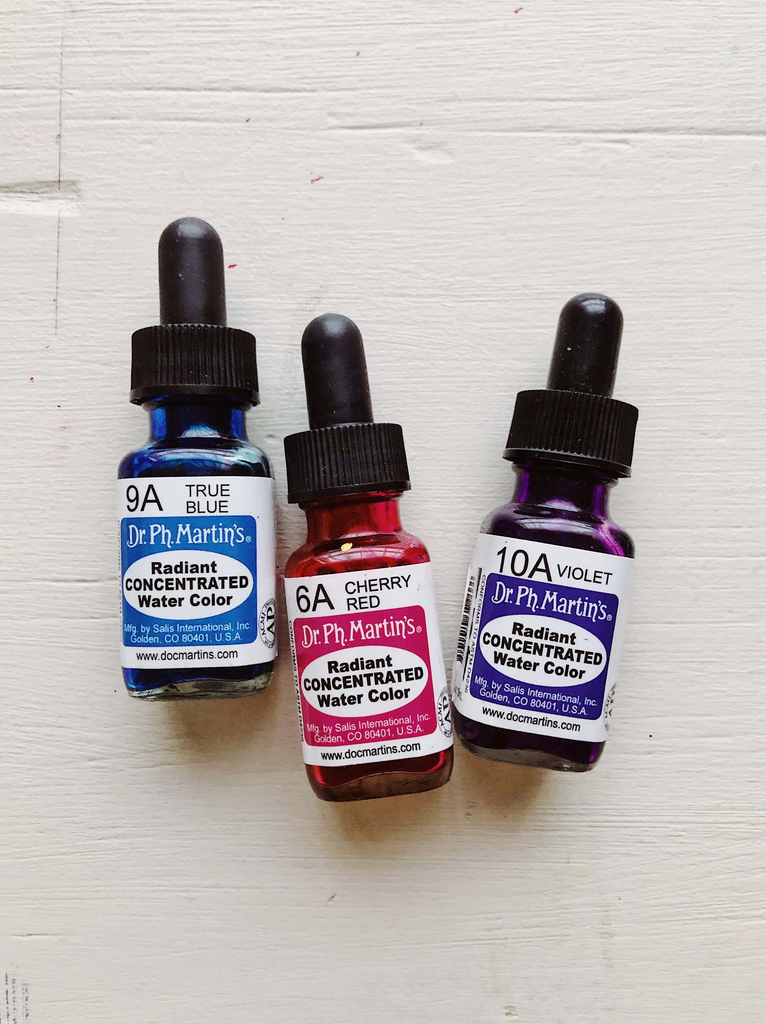
My favourite paints for achieving this look are “Dr. Ph Martin's Radiant Concentrated Watercolours”. As the name suggests, these watercolours are concentrated so the colours are vivid and bright.
Let me tell you a little more about these paints….

They come in small glass bottles with a dropper top and the consistency is a bit like a very watery ink.
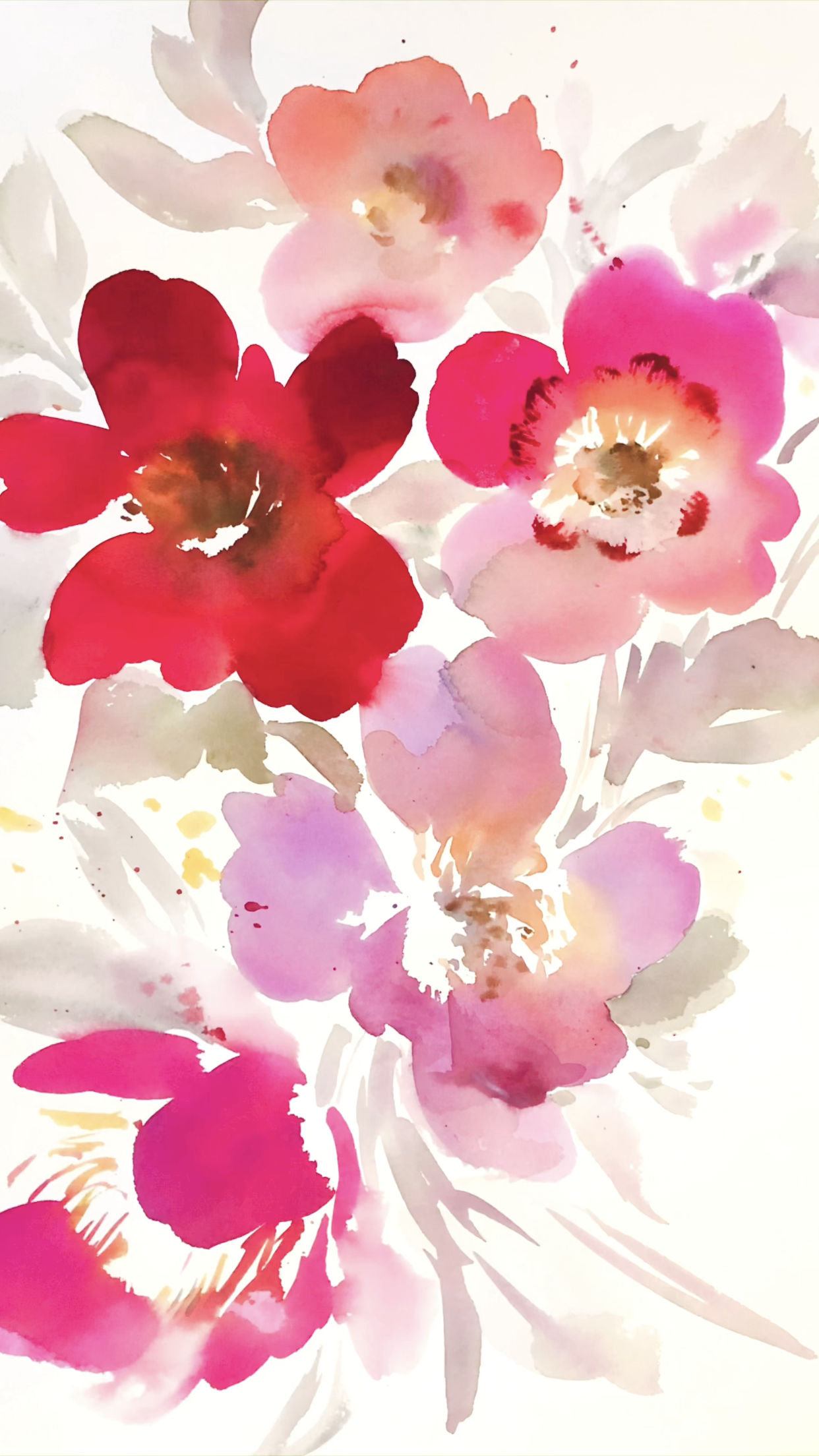
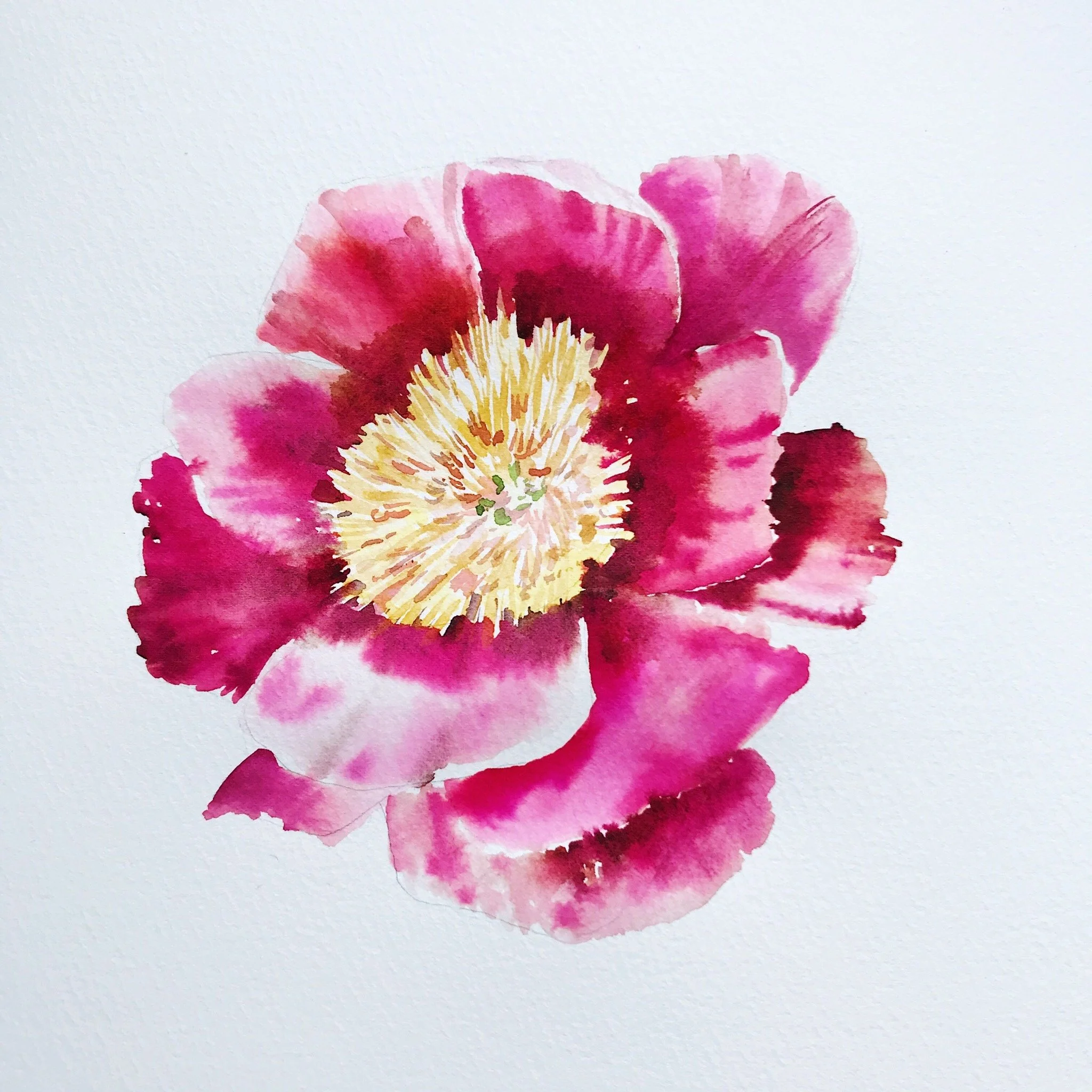
I find them too watery to use straight out of the bottle so I usually mix them on a palette with either some normal watercolours or gouache. This allows you to experiment with the final colours as well as thicken the paint up a little but most importantly will give you that vibrancy and deep saturation. A little goes a long way, you only need a few drops to achieve a really bright look.
These paints come in over 100 colours, so there is a lot to choose from, but I would say that the yellows and browns don't do much for me and I prefer the deeper blues, pinks and purples. My 3 most used colours are - True Blue / Cherry Red / Violet
Want to see them in action? Just take a look at the video below:
For those that like a bit more detail:
These paints are described as “not lightfast, and will fade under direct sunlight”. However, saying that I have used these paints for years and a lot of my paintings are still very vibrant. I also usually mix these concentrated watercolours with other paints so perhaps that helps keep the colour strong, but it may be worth considering some protection if it will be exposed to direct light.
Dr. Ph Martin's also has another range called “Hydrus”, and those paints are “archival and lightfast”. However, I do prefer the “Radiant” range as I feel the colour flows much nicer. But, it's worth experimenting with to see what you like and what works best for your needs.
Before I discovered these paints I found that my paintings lacked the vibrancy and inky flow that I was after, so these have really been a game changer.
If you have never used these paints before then I recommend getting a couple of colours to try first and experiment with.
Materials are very important to helping you achieve the look that you want but it does take a bit of trial and error to find those tools that work well for you.
However, paint is not the only thing that can help your paintings stand out and I have listed some useful tips below:
HOW TO MAKE YOUR PAINTINGS POP
1. Re-evaluate the paints that you use. When purchasing new paints just purchase a couple of colours and experiment with them. Test and see how bright they dry straight out of the tube using minimal water.
2. Make sure you have clean water, muddy water will muddy your paintings. Try having a couple of water jars next to you when painting. Clean your brush thoroughly before using lighter colours. Yellow is a tricky colour to get right, usually I make sure to clean my brush before using it, as a muddy brush really effects it's brightness.
3. Try layering up your watercolour paintings. Your paintings will always dry lighter than when you first put the paint on. After your painting has dried, try adding another layer of colour with less water over the top of some of the areas of your painting to add more depth and help the artwork stand out.